
The NewTech Stack
Sovereign serverless cloud, for AIware apps that empower agentic nations, enterprises, and people, created by an open, mathematical network.
Load design and voice for web and copy work. Add the document or slides companion for those formats. Compare the skill version with rules.json; the published v2.35 rules govern current use. “Copy both” copies design and voice only. Downloaded companion templates retain their format rules.
Visual and verbal systems, paired. The copy bundle points to the current rules.json. Use the companion document or slide skill when creating those formats.
Use this guide.
Start here whether you are an agent or a human. The rules below are operational instructions, not background reading.
For agents
- Fetch
rules.jsonand confirm the current version. - Load
icp-brand-designfor visual work andicp-brand-voicefor copy. Add the document or slides companion only for those formats. - Create against the current rules and examples. Do not infer new colors, claims, terminology, or treatments.
- Validate copy, contrast, responsive behavior, assets, and format-specific constraints before delivery.
For humans
- Begin with Positioning and Voice before choosing a visual treatment.
- Use Color, Type, Components, and Identity as the shared foundation.
- Open the relevant applied section for social, themes, signatures, wallpapers, or documents.
- Download the production asset or skill package instead of recreating it from a screenshot.
What ICP is.
If any copy or design disagrees with this section about what ICP is, the copy or design is wrong. The top line below is locked.
Master strap, locked. The New Tech Stack, exactly title case, with no final period. “Tech Stack” is one phrase anchor, an explicit exception to the usual single-word rule. It leads common public positioning. Full introductions retain the complete subline; compact formats use a labeled adaptation. Signatures may omit a marketing line and wallpapers need no strap. The category is a new tech stack, not generic AI-agent hosting and not a generic blockchain pitch.
Canonical hero subline. Sovereign serverless cloud, for AIware apps that empower agentic nations, enterprises, and people, created by an open, mathematical network. Only AIware is italic. The audience order is nations, enterprises, people. Keep the comma before the network clause and final period. The locked word “empower” is not prohibited filler in this sentence.
Optional supporting pillars. On-demand · Tamperproof · Always-on · Fluid · Yours. When used, keep this order and italic Yours. They are not compulsory beside the full subline or on a compact banner. Supporting audience-specific benefits do not replace the locked introduction.
Editorial alternate. Sovereign cloud. Software that's alive. Use only on editorial parchment surfaces where the alive metaphor is more useful than the category claim, such as long-form essays or the opening of a deep-dive document. Never use it on the homepage, a launch banner, or a deck cover. If in doubt, use the master strap.
Long form: ICP is a new tech stack that runs the whole app on a sovereign, serverless cloud: the frontend, the data, the backend logic. Apps are generated on demand through AI chat and keep extending themselves over time with new natural-language functionality, while the network underneath runs them tamperproof, always-on, and under your control.
- On-demand. AI-assisted creation reduces setup work; it does not remove application design, permission, or security responsibilities.
- Tamperproof. Infrastructure-level protection under protocol assumptions. Not immunity to app bugs, business-logic attacks, compromised credentials, malicious authorized changes, or every outage.
- Always-on. Distributed execution and fault tolerance, not an unconditional uptime promise or SLA.
- Fluid. Authorized functionality changes and upgrades remain possible. Never promise “no redeploy.” Typed safe-upgrade mechanisms do not prove every migration lossless; test the migration logic.
- Yours. Control and jurisdiction choices, with the deployment model explained. Do not turn the benefit into a blanket zero-downtime migration claim.
Out of scope. Products with their own brand identity, like OISY and Caffeine, are not covered here. They have their own voice and visual systems.
Surface treatment, monochrome hero and parchment hero.
Monochrome foreground, colored media. The leading media hero uses warm-gray “The New,” near-white italic “Tech Stack,” and neutral subline and controls on deep ink #0b0f0c. Approved footage keeps subdued color. It is not grayscale, and its highlights do not become UI accents. Use a calibrated scrim, no grid, and a hard cut to parchment. The media section specifies playback, crops and contrast. Document and slide composition remains governed by its companion skill.
Parchment hero is the alternate treatment for editorial surfaces: long-form pages, documentation, this guide's interior, product surfaces that need light editorial calm. Default when no data-hero attribute is set. Surface bg parchment #faf9f5, surface fg ink #1a1a1a, accent rust #a8482b on the italic anchor and CTAs.
Same master, surface-aware styling. The New Tech Stack keeps its exact case and phrase anchor. Rust may emphasize the phrase on parchment editorial surfaces, never in the media hero. Documents stay monochrome. Do not force a full subline into unreadable small formats.
CTA scope. Rectangular translucent outlined tiles: Get a cloud engine and Upgrade your agents. Keep HTML labels separate from the media. No rust, green, glowing text or arbitrary decorative gradients. The guide's internal skill buttons are not a public hero CTA template.
AIware, the product noun.
Spelling, locked. Always written AIware as one word: capital A, capital I, lowercase ware. Never AIWare, aiware, AI-ware, AIWARE, or AI ware. Treat as a proper noun.
What it means. A new category of software that AI agents generate, extend, and operate on demand. AIware apps are generated through AI chat, expose their data and logic to the agent so it can add new functionality on the fly, and run end-to-end on the Internet Computer so they stay tamperproof, always-on, and under the user's control.
Part of speech. Noun and adjective. Runs AIware (noun). AIware apps (adjective). Sophisticated AIware (noun). The same word does both jobs without modification.
Do not substitute. Do not replace AIware with AI agents, agentic apps, or agent-built apps on surfaces that reference the internetcomputer.org product noun. Those phrases describe the actors or the building style; AIware is the artifact. AI-native is a separate accepted attribute that describes the Internet Computer itself, not a substitute for AIware; see the next section.
Relationship to the master. The New Tech Stack names the category, without a final period. AIware names what runs on it. The “alive” metaphor is an editorial alternate, not a competing master.
AI-native, the attribute.
Spelling, locked. Always written AI-native with an ASCII hyphen: capital A, capital I, hyphen, lowercase native. Never AI native (two words), ai-native (all lowercase), AINative, or AI-Native.
What it means. Infrastructure designed for AI agents to operate on apps through permitted data and logic interfaces. It does not guarantee every app is safe, always available, or free of administration. AI-native describes the cloud; AIware describes the software it runs.
Part of speech. Adjective only. AI-native cloud (attributive). The Internet Computer is AI-native (predicate). Never used as a noun. Never an AI-native.
Relationship to AIware. AIware and AI-native describe different things. AIware is the software category ICP runs, AI-native is the attribute of ICP that makes running AIware possible. Both can appear in the same sentence: The Internet Computer is an AI-native cloud that runs AIware. Do not swap one for the other. Do not use AI-native where the sentence is about the software category (use AIware instead). Do not use AIware where the sentence is about the infrastructure attribute (use AI-native instead).
Where it applies. Any surface where the attribute of the Internet Computer, sovereign cloud, or ICP-hosted infrastructure is being described. Investor pages, press pages, decks, developer docs, positioning statements. Optional on every surface; use where it adds clarity about what kind of cloud ICP is.
Homepage body paragraph.
Below the master strap on the internetcomputer.org homepage, one paragraph explains what ICP is in one factual sentence per idea.
The Internet Computer is a frontier serverless cloud for AIware apps, created by a mathematical, open network. It combines independently operated hardware, including hyperscaler hardware, to form a universal tech stack that offers an alternative to traditional tech stacks. Tamperproof apps are immune to infrastructure attacks, always-on, can be auto-scaled, need minimal administration, and natively support digital assets. It is the platform for agents that build.
Canonical wording. Keep “frontier,” write “independently operated” without a hyphen, and use “natively support digital assets.” Keep the comma and final period in the hero subline.
Claim scope. Infrastructure protections have the boundaries above. “Minimal administration” is not zero administration, auto-scaling is not unlimited capacity, and native digital assets are a capability, not financial advice or a return guarantee. Develop benefits with these qualifications rather than amplify observed homepage proof labels.
Serverless, an accepted modifier.
Two complementary descriptors. “Sovereign serverless” expresses control and jurisdiction in the hero. “Frontier serverless” expresses category and capability in explanatory body copy. Preserve both current uses.
Why. When the audience needs the mental model of AWS Lambda or Cloudflare Workers to grok what ICP is, and the sovereignty story matters in the same sentence, serverless earns its place. Investor pages, category-defining hero copy, and comparisons with hyperscaler serverless offerings are the natural surfaces.
Master strap unchanged. The master strap The New Tech Stack does not take the modifier. The alternate strap Sovereign cloud. Software that's alive. does not take the modifier either. The modifier lives in the master sub-strap and in expanded copy: body paragraphs, investor pages, category headlines. Strap lines stay short.
Do not flatten the distinction. Do not require “sovereign” beside every use of serverless, or rewrite frontier to sovereign. Explain the operating model without reducing ICP to generic agent hosting or a blockchain pitch.
Audience triad, agentic nations, enterprises, and people.
Order, locked. Nations first, enterprises second, people third. Serial comma before and. The sequence matches the sovereignty argument: nations are the surface where sovereign cloud matters most, enterprises are the surface where tamperproof workloads matter, people are the third layer that inherits both.
What agentic means here. Operated by agents, or operating agents. Agentic nations are governments whose services are increasingly delivered and administered by AI agents. Agentic enterprises are companies whose operations run through AI agents. Agentic people are individuals whose tools and workflows are agent-driven. The modifier distributes: you write it once at the front, not three times.
Do not substitute. Do not shorten to nations, enterprises, and people: that drops the agentic frame and reads as generic marketing. Do not expand to agentic nations, agentic enterprises, and agentic people: that is redundant. Do not swap people for individuals, users, or citizens: people is deliberate, it covers all three.
Where to use it. Homepage hero sub-strap, investor pages, decks, press pages, category-defining copy. Individual pillars can appear alone on segment-specific surfaces (a nation-focused page can lead with agentic nations). Optional on developer docs and product UI.
How it reads.
Calm, factual, plain. Like The Economist, not a startup pitch deck. Four voice attributes everyone working under this brand should keep in mind.
- Factual. Every sentence states something concrete. If you can remove a sentence without losing information, remove it.
- Plain. Read every sentence aloud. If you would not say it to a smart non-specialist friend, rewrite it.
- Calm. No hype, no urgency theatre, no exclamation marks, no emoji. The product is self-evidently interesting.
- Sovereign by math. When security, uptime, or tamperproof execution come up, the subject is the network, not DFINITY and not the cloud underneath.
Sentence case is the default. The locked master The New Tech Stack is the explicit title-case exception. Normally a heading has one italic word; Tech Stack is the locked phrase exception. Only AIware is italic in the full subline. Keep body text roman except genuine asides, captions and attributions.
No em-dashes, anywhere. The U+2014 character is banned. Replace with a colon, a period, or parentheses depending on the sentence shape.
Replace bare onchain and on-chain with the underlying app attribute (tamperproof, unstoppable, sovereign, end-to-end on the network). The word is a category label, not a benefit.
High-signal substitutions.
| Don't say | Say instead |
|---|---|
| Install dfx | Install the icp CLI |
| Blockchain platform | Sovereign cloud / tamperproof, always-on infrastructure |
| Decentralized (as the pitch) | Tamperproof, unstoppable, sovereign |
| Smart contracts (to developers) | Canisters, or agent-built app backends |
| Build onchain apps | Build tamperproof, always-on apps on a sovereign cloud |
| Onchain governance | Tamperproof governance / governance enforced by the network |
| Fully on-chain | End-to-end on the network |
| Tamper-proof / tamper proof | Tamperproof (one word, always) |
| Enterprise-grade security you can trust | Tamperproof by the network, integrity enforced across the nodes |
| Revolutionizing / next-generation | Name the specific capability |
One accent, calm surfaces.
Parchment and ink, with rust as the single primary brand color. A small set of section stripes for category coding only. Section colors never appear on body text, CTAs, or running emphasis.
Surface and ink
Surface texture
Parchment is the reading canvas; sunk parchment distinguishes alternating sections and panels. A near-invisible grid is optional on selected parchment/editorial panels, never required on a hero and never placed over media or running body prose.
The default surface for everything. --icp-bg · #faf9f5. Body text, prose, all standard sections.
Use to differentiate adjacent sections, sunk panels, code-example wrappers. --icp-bg-sunk · #f3f1ea. Hairline still wins above and below.
Primary accent
Section stripes (category coding only)
Colored art. Neutral foreground.
Approved media is not grayscale. Blue and violet landscapes, code panels, cubes and linked geometry may keep their subdued cyan, yellow and pink highlights. Those colors belong to the footage, not UI text or buttons.
Static poster only. No video request until you opt in.
Playback and fallback
- Separate HTML copy from media. Use positioned media beneath the copy, intentional
object-fit: covercrops, and no stretching or burned-in slogans. - Muted, playsinline, visible controls. Animation longer than five seconds needs a pause control. Loop only after a seam check.
- Reduced motion or data saving: static poster, no video source and no video load. This demo is static by default even where data-saving APIs are unavailable.
- Pause out of view or when the tab is hidden. The cover above is a still so the skill callout stays readable.
The NewTech Stack
Sovereign serverless cloud, for AIware apps that empower agentic nations, enterprises, and people, created by an open, mathematical network.
Get a cloud engine opencloud.org ↗ Upgrade your agents skills.internetcomputer.org ↗Mobile and contrast gate
Hero subline: at least 20 CSS px at 375-430 px viewport widths. The specimen uses 20 px. Test line wraps, CTA targets and chosen crops at both widths.
Check the brightest frames and each crop, not only a quiet poster. Increase the scrim or choose a calmer crop, rather than color the text. These are acceptance thresholds, not a blanket claim about every source frame.
Implementation: Use assets/hero/hero-poster.jpg as the static fallback. Apply a centered cover crop with an 82% #0b0f0c scrim and no grid.
Scoped exceptions, not a new decorative style. Approved source 3D, the flat gradient infinity and contrast scrims are permitted. Generic decorative gradients, invented crypto cubes or shields, glow text and arbitrary 3D remain out of scope. An editorial grid is optional on parchment panels, never over video or running body prose.
Source requirement. Use approved footage without embedded marketing text. Keep all headline, subline, and CTA copy as accessible HTML above the media.
Three faces, three jobs.
Newsreader for what you read. Inter for what you click. JetBrains Mono for what the system reports. No fourth face anywhere.
Components.
Don't invent new primary patterns. If a surface needs something not listed here, raise it before shipping.
#1a1a1a background, regardless of theme. White text, rust arrow.skills.internetcomputer.org
A growing skill library for Claude Code, Codex, Copilot, Cursor, and Perplexity. Make agents into ICP experts.
OpenChat
Tamperproof messaging that runs end-to-end on the network. Section coded with deep teal stripe.
--icp-indicator-teal. Never use Newsreader for stat numerals.List rows
The mark at sixteen pixels.
A favicon's job is to let the infinity mark read in a tab strip, a bookmark bar, a pinned tab, an iOS home screen. The brand's typography and grid texture do not survive at sixteen pixels, so the favicon strips down to the gradient infinity on a transparent canvas. The browser places it on its own chrome, light or dark, and the mark holds.
Sizes and surfaces
Five raster sizes ship: 16, 32, 48, 192, 512. The 16 px tile is the only size most users ever see, so the mark is centered with comfortable padding and the gradient is allowed to soften rather than fight the pixel grid. The 192 and 512 sizes cover Android home screens and PWA install dialogs.



In a tab strip
×
×
×
iOS home screen and Safari pinned tab
iOS does not auto-theme home-screen tiles, so two variants ship: a parchment fill for light wallpapers and a deep-bark fill for dark wallpapers. The Safari pinned-tab mark is a single-color silhouette which Apple recolors at runtime; the brand value is rust #a8482b, declared in the color attribute of the mask-icon link.

apple-touch-icon · parchment fill

apple-touch-icon-dark · deep bark
Safari pinned tab · brand-recolored
Why no grid background
The optional editorial grid does not survive at sixteen pixels. Let the gradient infinity resolve cleanly. Grid belongs only on selected parchment/editorial panels, never the media hero, running body prose, or document pages. It is not required on banners.
HTML to ship
<link rel="icon" type="image/svg+xml" href="/favicon.svg" />
<link rel="alternate icon" type="image/x-icon" href="/favicon.ico" />
<link rel="apple-touch-icon" sizes="180x180" href="/apple-touch-icon.png" />
<link rel="mask-icon" href="/safari-pinned-tab.svg" color="#a8482b" />
<meta name="theme-color" content="#faf9f5" media="(prefers-color-scheme: light)" />
<meta name="theme-color" content="#14110d" media="(prefers-color-scheme: dark)" />Light by default, dark on demand.
The brand ships light editorial as the default. Dark is opt-in for product surfaces that need a dark reading environment, like NNS at night, dashboards, or developer tools. Apply via data-theme="dark" on <html>. Never auto-switch on system preference.
Parchment #faf9f5, ink #1a1a1a, rust accent #a8482b.
Bark #14110d, bone #f0ebe0, ember #c25a37.
Reading theme is not hero art. Parchment is the default editorial canvas. Product dark theme is explicit opt-in. The scoped media hero is separately deep ink with neutral foreground and a hard cut to parchment. Slides retain their companion cover and closing treatments; documents stay white and monochrome.
How to switch. Apply data-theme="dark" on <html>. Persist the choice in localStorage if the surface offers a user toggle. Never use prefers-color-scheme to auto-switch: light is the deliberate default, and the choice should be explicit.
What does not change between themes. The CTA bar always uses near-black #1a1a1a as the inverted call-to-action surface. Type system, spacing, radii, and component patterns are theme-independent.
What does change. Backgrounds, foregrounds, hairlines, and the accent shift one notch warmer in dark (rust #a8482b becomes ember #c25a37 for AA on bark). Section stripe colors deepen for AA contrast.
Design review checklist.
- Uses
tokens.cssvariables, no hardcoded brand hex values. - Light is the default. Dark only via explicit
data-theme="dark". - Newsreader for editorial type, Inter for UI chrome, JetBrains Mono for technical readouts. No other faces.
- Sentence case except the locked title-case master The New Tech Stack. UPPERCASE only on micro-labels.
- Normally one italic heading word. Tech Stack is the locked phrase exception; only AIware is italic in the canonical subline. Preserve document and slide overrides.
- One primary accent on the page (rust
#a8482b). Section stripes scoped to category coding only. - Body prose capped at 720px.
- 1px hairlines in
--icp-rule, no heavy borders. - Pill radius (
9999px) used only for CTAs. - CTA bar background is near-black
#1a1a1ain both themes. - Focus states visible, AA contrast verified.
- No emoji, generic decorative 3D, invented crypto cubes or shields, or glowing text. Approved source 3D media is permitted within its scope.
- No arbitrary decorative gradients or drop shadows. Flat gradient infinity and calibrated contrast scrims are approved exceptions. No grid over video or body prose.
- External links use
↗affordance, not an SVG icon. - No em-dashes anywhere (U+2014).
- No bare "onchain" or "on-chain" as nouns, attributes, or selling points.
- Favicon ships as the gradient infinity on transparent canvas, no grid texture, no container.
- HTML head includes
icon,alternate icon,apple-touch-icon,mask-icon, and boththeme-colormeta tags.
The signature as a brand surface.
Composition and generator retained. A marketing line is optional; do not force the full subline or media into a signature.
Every email out the door carries the brand for two seconds at the bottom of the message. The system here does not try to make a billboard out of those two seconds. It carries the same composition logic as the social profiles in § 08: a still mark, a Newsreader name, an Inter middot meta line, an uppercase eyebrow link row with the rust accent on the primary link only, a hairline rule, and a two-sentence disclaimer in secondary tone. The mark is still. Animated logos read as unprofessional and most clients block animation anyway. The template ships as a table with inline styles, which is what Outlook, Gmail, and Apple Mail need to render the signature consistently.
Generator
Type a name, title, and organisation. The generator renders the signature live in light and dark, then copies the production HTML to the clipboard. The mark, fonts, colours, and disclaimer travel with the paste; the wrapper preview chrome is stripped before copy.
"Copy HTML" gives you the raw template for editors that accept HTML source (Outlook .htm files, Apple Mail .mailsignature edits, Superhuman). "Copy rendered" copies the live signature element so you can paste it directly into Gmail or Apple Mail signature editors.
Composition rules
Right-sized for real inboxes. The signature is metadata, not a billboard. The shipped sizes are calibrated to sit roughly one notch above the standard 14px Gmail body text, so the signature reads as a clean closing block rather than an oversized lockup that competes with the message itself. Every measurement below is deliberate; bigger is not better.
The mark is still and small. Animated marks read as unprofessional in a business signature, and most clients (Outlook, Gmail mobile, Apple Mail in low-data mode) block animation by default anyway. Use the same gradient infinity that ships in the favicon set, rendered to a 112 × 112 PNG and displayed at 40 × 40 for crisp Retina without dominating the block. The mark embeds as a base64 data URI in the HTML so it survives image-blocking and does not depend on a hotlink.
Newsreader for the name, Inter for everything else. Name is Newsreader weight 500 at fifteen pixels, line-height 1.25, letter-spacing -0.005em. Title and organisation are Inter weight 400 at twelve pixels in --icp-fg-secondary, separated by a middot (·) with two spaces on each side. The middot replaces the pipe character. Pipes read as code; middots read as editorial.
One rust link, one secondary link. The eyebrow link row is Inter weight 500 at ten pixels, UPPERCASE, letter-spacing 0.16em. The primary link is internetcomputer.org in the rust accent. The secondary link is dfinity.org in --icp-fg-secondary. A hairline pipe in --icp-rule separates them. Skills surfaces always come first, matching the locked order on the live site (skills.internetcomputer.org → caffeine.ai → icp.ninja); since neither of those URLs sits in a personal signature, the live-site primary internetcomputer.org takes the rust accent and dfinity.org takes secondary.
Hairline rule, never a coloured bar. The horizontal hairline below the stack uses --icp-rule at 1 pixel (warm ivory #e7e3da on light, soil #2d2820 on dark). The previous template used a vertical blue bar in a non-brand colour. The hairline rule is the same separator pattern used on every brand surface; it travels with the system.
Two-sentence disclaimer ceiling. Disclaimers grow over time and end up longer than the signature itself. The shipped template caps the disclaimer at two sentences in Newsreader weight 400 at eleven pixels, line-height 1.55, in --icp-fg-secondary, with a 620-pixel max-width so it does not flow as one long line on wide screens. Anything beyond the two sentences belongs in a separate confidentiality footer at the bottom of the message thread, not in the signature itself.
Outlook-safe, table-based. The production HTML uses a <table> for layout because Outlook on Windows uses Word as its renderer and ignores flexbox, grid, and most modern CSS. Styles are inline because many clients strip <style> blocks. The mark is a base64 PNG because hotlinked images get blocked by default. Font stacks fall back from Newsreader to Georgia and from Inter to system-ui, so the signature still reads on brand even when the web fonts are not installed locally.
How to apply
Gmail. Settings (gear) → See all settings → General → Signature → Create new. In the generator above, click "Copy rendered", then paste into the Gmail signature editor. The mark and inline styles travel with the paste. Save changes at the bottom of the settings page.
Apple Mail. Mail → Settings → Signatures → add a new signature, then drag and drop a temporary placeholder image. Quit Mail. In Finder, open ~/Library/Mail/V*/MailData/Signatures/ and replace the .mailsignature file contents with the output of "Copy HTML". Reopen Mail and the signature is live.
Outlook. File → Options → Mail → Signatures → New. Click "Copy rendered" and paste into the editor. Outlook strips some inline styles on paste; if the layout breaks, edit the underlying .htm file in %AppData%\Microsoft\Signatures\ and replace it with the output of "Copy HTML".
Other clients. Most modern mail clients (Superhuman, Spark, Hey) accept HTML signatures via a paste-from-browser flow. Click "Copy rendered" and paste into the client's signature editor.
What does not ship
- No animated mark. Ever. The infinity is still.
- No coloured separator bar. The vertical pipe in a non-brand blue is replaced with a hairline rule.
- No bold sans-serif name. Newsreader 500 carries the name in the same editorial register as the brand surfaces.
- No phone number, no street address, no "Sent from my iPhone" tail. Three lines is enough.
- No social icon strip. The eyebrow link row is the only outbound surface.
- No quote of the day, no calendar booking link in rust, no "please consider the environment before printing" line. The signature is editorial, not a billboard.
Download
The generator is the recommended workflow. The static templates remain available for users who want a versioned copy or who edit the HTML directly: light is the default, dark is for users whose mail client renders dark mode by default.
Device wallpapers.
Optional text-free brand assets. Use the prepared files as supplied. Do not treat them as templates for headlines, campaign copy, badges, or product claims.
iPhone
Lock and home variants in light and dark, prepared for iPhone 16 Pro Max at 1320 × 2868.
Download iPhone set ↓Pixel Fold
Cover and inner-screen lock and home variants in light and dark.
Download Pixel Fold set ↓Galaxy Fold
Cover and inner-screen lock and home variants in light and dark.
Download Galaxy Fold set ↓All devices
Twenty production files grouped by device, surface, and theme.
Download all wallpapers ↓The document as a brand surface.
Every memo, brief, contract, board pack, and filing that leaves the foundation is a brand surface, but a document is not a landing page. It gets printed, scanned, faxed, forwarded, and re-PDF'd, and it needs to survive every one of those transformations. The template here strips the visual system to its editorial minimum: a white page, a single face for the heading stack, one accent color that lives only inside the footer wordmark, and no boxes, no eyebrows, no italic-rust emphasis. Ships as a .docx with a locked style library named D Title, D H1, D H2, D H3, D Body, and eight more. Open in Word, Google Docs, or Pages, pick styles from the pane, and start writing.
Preview
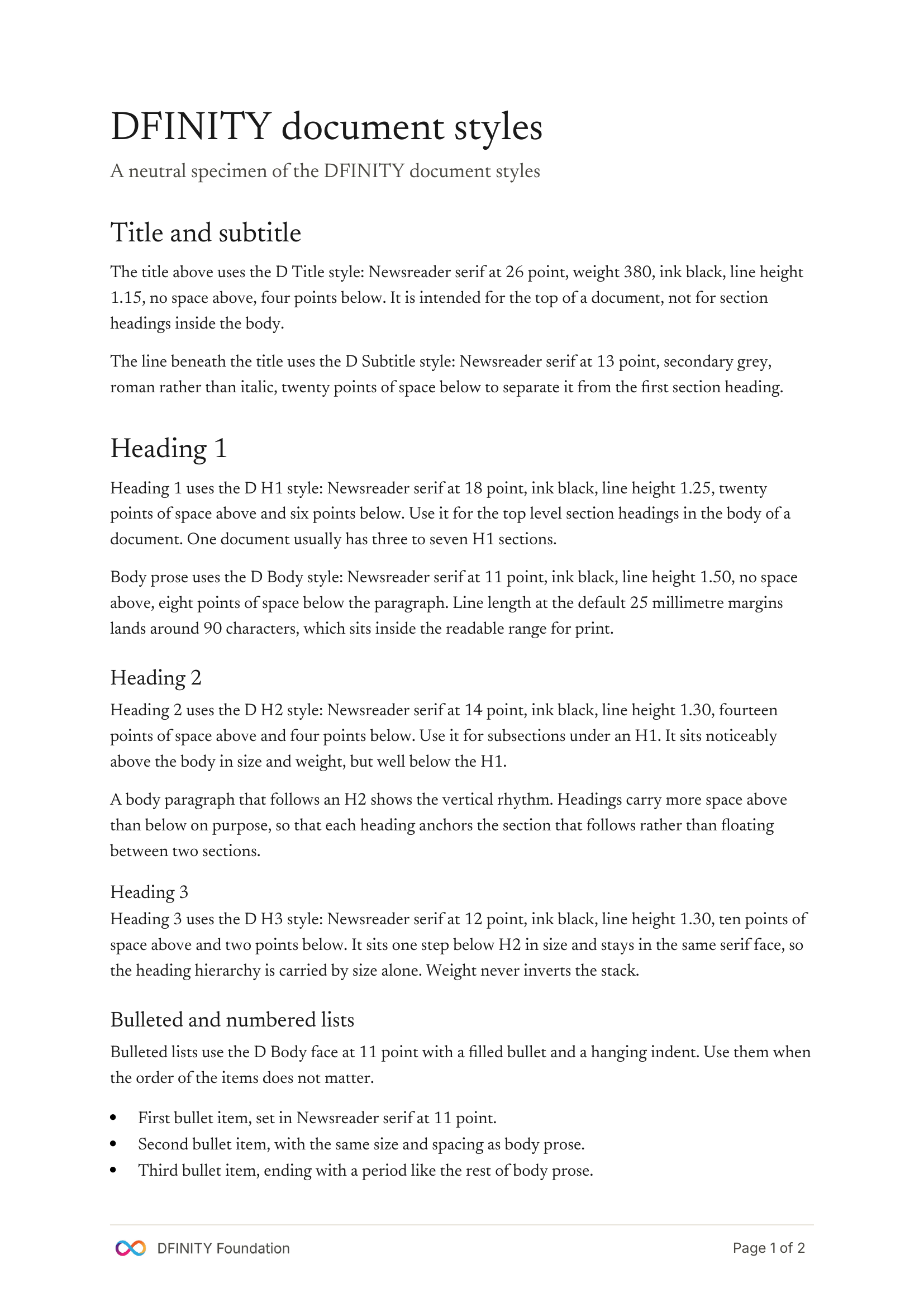
Page one of the shipped template rendered at A4. The specimen text documents each style in place, so you can read what a heading, a body paragraph, a bulleted list, a numbered list, a block quote, and a code block look like, and then delete the specimen and write your own document.
Composition rules
White page, not parchment. The website ships on parchment #faf9f5 because parchment is a screen surface where the tone reads as editorial. Documents get printed on white paper and scanned into archives. A parchment background would either render as a pale grey band that makes the print look dirty, or force a full-page fill of ink that wastes toner and makes the print look like a marketing brochure. Documents are white.
Monochrome ink on white paper. The rust accent is scoped strictly to single words and short phrases on the website: an emphasis word in a heading, an inline term, a CTA label, an indicator dot, a focus ring. A document has none of those legitimate targets. There is no CTA in a contract. There is no indicator dot in a board pack. The rust color travels with the document only inside the footer infinity mark, which lives as a rendered PNG. Text stays ink. Do not colorize headings, do not colorize inline terms, do not shade backgrounds. The Economist, the Financial Times, McKinsey, the Supreme Court, and every serious document publisher use one ink on one page. So do we.
One face for the heading stack. Title (26pt), H1 (18pt), H2 (14pt), H3 (12pt), and body (11pt) are all Newsreader. Hierarchy is carried by size alone. Weight never inverts the stack: an H3 in bold sans-serif shouts louder than the H2 above it because font weight beats size at reading distance, which is a common but wrong pattern from Word's default styles. If a fourth level is ever needed below H3, it becomes a bold Newsreader lead-in inside the body paragraph, not a fourth heading style.
Sentence case on headings. Proper names keep their natural case. A quotation of the locked master The New Tech Stack retains its exact case without importing web hero styling.
No eyebrow markers, no callout boxes, no italic-rust emphasis. The § NN mono eyebrows from the website and the italic-rust anchor word from the deck template do not appear in documents. A memo or a contract is a transactional artifact, not a website section or a slide cover. Eyebrows and rust anchors read as overdesign at the density of a business document. Callout boxes with fills and rules photocopy poorly and inflate the page weight. If a passage needs to stand out, use a block quote (indented italic) or a bulleted list.
DFINITY footer cluster, calibrated for print. The DFINITY wordmark and infinity mark sit at the bottom-left of every page. "Page X of Y" sits at the bottom-right, in Inter 9pt, aligned to the cap-top of the wordmark at zero pixel delta at 600dpi. The footer is the only chromatic element on the page. It carries the brand at the bottom of every sheet without competing with the content.
No em dashes, no emoji, no hyperbole. Standard brand rules apply. "Tamperproof" is one word. "Onchain" and "on-chain" are banned and replaced with the underlying app attribute (see the Voice section).
Style library
Twelve paragraph styles and two character styles. Every style is prefixed D so it groups in the styles pane. The next-paragraph rule flows a heading into body automatically, and keep-with-next is set on every heading so it never orphans at the bottom of a page.
| Style | Face | Size | Use for |
|---|---|---|---|
D Title | Newsreader | 26pt | Document title, top of page 1 |
D Subtitle | Newsreader | 13pt secondary | Optional subtitle under the title |
D H1 | Newsreader | 18pt | Top-level section heading |
D H2 | Newsreader | 14pt | Subsection under an H1 |
D H3 | Newsreader | 12pt | Third-level heading, same face, one step smaller |
D Body | Newsreader | 11pt | Body prose, the default paragraph |
D Small | Inter | 9pt secondary | Footnotes, disclaimers, contact strips |
D Caption | Inter italic | 9pt muted | Figure, table, image caption |
D Quote | Newsreader italic | 11pt secondary | Block quote, indented 10mm |
D CodeBlock | JetBrains Mono | 10pt | Command lines, config snippets, fixed-width readouts |
D Code | JetBrains Mono | 10pt inline | Inline command names, file paths, config keys |
D Strong | Newsreader bold | 11pt | Rare inline emphasis inside body prose |
What does not ship
- No color on the page. The rust accent lives only inside the footer infinity mark.
- No parchment background. Documents are white.
- No
§ NNeyebrows. That is a website pattern. - No italic-rust emphasis word inside headings. That is a hero and deck-cover pattern.
- No callout boxes with ivory fill and rust rule. Use a block quote or a bullet list.
- Sentence case, except proper names and a quotation of the locked master The New Tech Stack. No forced hero styling.
- No em dashes. Ever.
- No emoji. Ever.
- No fourth typeface. Newsreader, Inter, and JetBrains Mono are the entire stack.
- No bold sans-serif at H3. That inverts the hierarchy.
Download
Two artifacts ship. The .docx template is what most people want: open it in Word or Google Docs, delete the specimen content, and start writing. The skill package is for AI agents: drop the zip into your agent's skill library and the agent will generate on-brand documents programmatically using the same style set and the same build script this page describes. PDF is not shipped as a separate download because the .docx exports directly to PDF from Word, Google Docs, or Pages with the fonts and layout intact.
The profile as a brand surface.
Current X and personal LinkedIn banners adapt the master to a compact format: approved dark backdrop, neutral foreground and right-aligned visible glyph edges.
Profile picture
The retained avatar is 400 × 400 PNG on parchment
#faf9f5, with a centered gradient infinity and no grid. It may sit beside a dark banner; continuity does not require matching backgrounds. Check the mark at feed and comment sizes.LinkedIn personal profile banner
Current v2.35 export: 1584 × 396, 4:1. Prefer the native-size PNG. The 6336 × 1584 derivative is resampled, not extra native detail. Keep the lower-left avatar region clear and validate at 375 and 430 CSS px displayed widths with crop simulation. Personal and company aspect ratios are not interchangeable.
v2.35 current · 1584 × 396 native · compact adaptation
X (Twitter) banner
Current v2.35 export: 1500 × 500, 3:1. Keep the lower-left avatar zone clear and inspect phone crop and lower-right action controls. Current export right edge is 1428 px. Earlier platform coordinates are test assumptions, not verified current guarantees.
x-banner.png · 1500 × 500 · upload spec
Composition rules
Dominant master. The New Tech Stack, exact title case, no final period. Neutral foreground on the approved dark backdrop. No grid or colored italic text.
Compact adaptation, explicitly labeled. Sovereign serverless cloud for AIware apps. It may break after “cloud.” This is not the full canonical hero subline. The full introduction remains in § 01.
Quiet secondary elements. A discreet mark or wordmark is permitted, not mandatory. No guide eyebrow, version, guide URL or compulsory pillar row.
Optical right edge. Align visible glyphs, not only text boxes. Current export edges: X 1428 px; LinkedIn personal 1512 px. Preserve breathing room from crop and avatar zones.
Phone readability. Test actual display at 375 and 430 CSS px widths, including crop and avatar overlap. Target about 12 CSS px minimum for the subline; shorten rather than shrink. Current subline export sizes are 55 px (X) and 56 px (LinkedIn), nominally about 13.75 and 13.26 CSS px at 375 px width. Raster pixels are not points and nominal sizing does not replace visual review.
What does not ship